Grids and how to create usable UI designs with them.

Dare Nuges
We must consider all necessary screens and content types before selecting an appropriate grid for our design projects.
We must consider all necessary screens and content types before selecting an appropriate grid for our design projects. Bring them together to see what grid can hold them, or use wireframes to experiment with different layouts to see which grid is appropriate and can handle any layout.

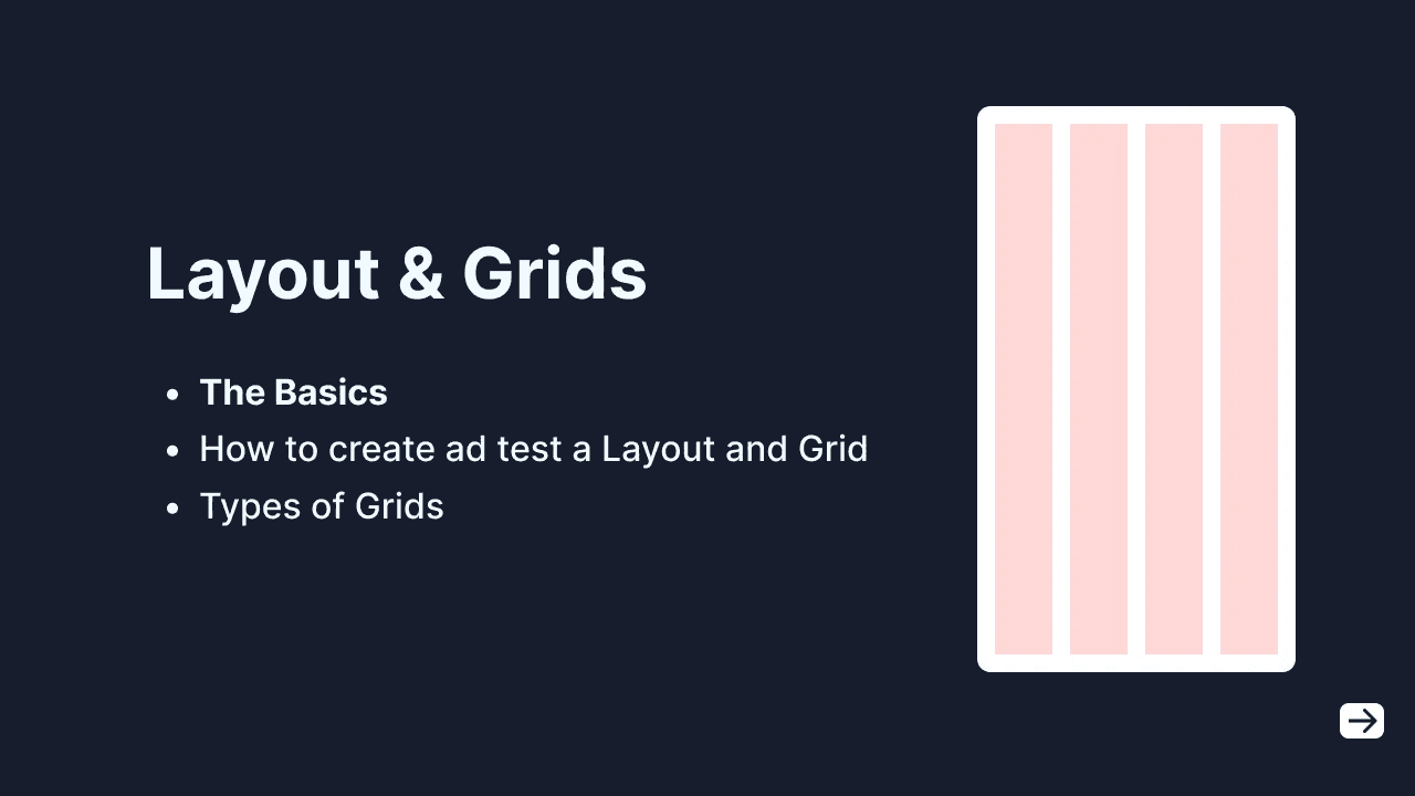
The Basics
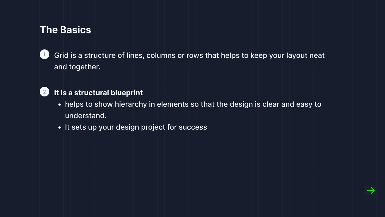
Even if we usually don’t see the grid in the final project, any slight change in the preset grid rules and guidelines will have a significant impact on the final project.
It is very important to create grid rules and guidelines from the beginning of a project because it allows for greater consistency and faster development.
How do we create or choose an appropriate Grid for our project?
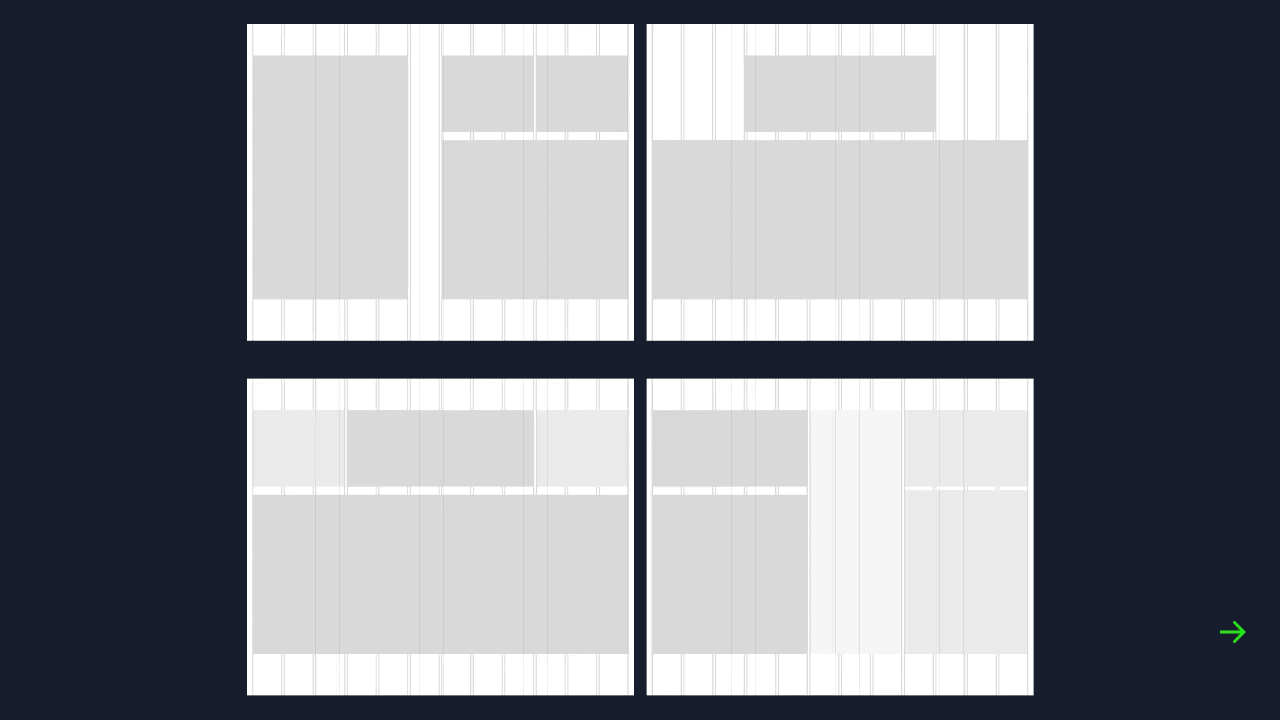
You must first try to construct the necessary screens and content types, then combine them and see how they fit in all possible scenarios.
This means that you should try laying out your content and imagining what form or shape it would take in your design before testing different Grids against it to find the best one.
You can use a wireframe to test different layouts on it and then check which Grids works for every possible scenario the layout is in.
Once you start testing the Grid, test it against screen types — with photos, data tables, forms or large text blocks. This will help to be ready for every possible scenario
Types of Grids
Horizontal Grids: This grid is depicted by the horizontal arrangement of vertical columns and margins (also called gutters) between them. They form the base of a layout and help us align elements horizontally. Don’t be confused by the name horizontal grid because of the vertical columns, just focus on how the direction or arrangement, it flows horizontally.
Vertical Grids: Here we have rows instead of columns stacked vertically. This can be used to set consistent heights in elements, sections and white-spaces. This main purpose of this type of grid is to create easy to scan sections for users.

Fluid Grid: The fluid grid as the name implies, it means that the grid adjusts to the size of the screen. It maintains an outside margin and gutter width but adjusts the width of the columns to fit the screen size. The column with is directly proportional to the size of the screen.
Fixed Grid: The fixed grid is the opposite of fluid grid. As the name implies it means that the grid stays fixed regardless of the screen size. It maintains a set value for both the columns and the gutters.
Base Value

Start your grids with choosing a base value. 10 is the most popularly used because any number is easily divisible by 10. Even your design app has a default nudge of 10. You can walk your way up from there an increase in multiples to get 20, 40, 80…
You can also use 8. I love using 8 because it allows me create external and internal nicer margins . Use multiples of 16, 24, 48…
To learn more about grids you can check this site where I learned most of my tricks.
https://www.designingui.com/